Twenty years of experience — and why the right tool for the job matters in web design and development.
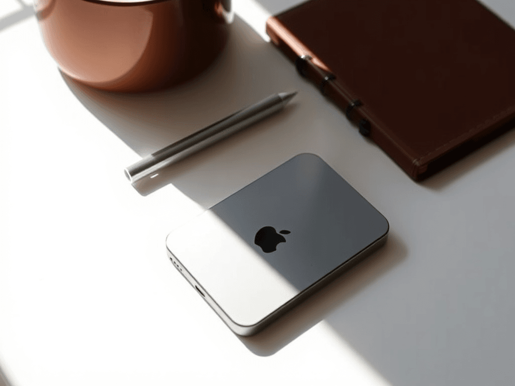
In web design, leveraging Apple Products not only enhances creative workflows but also provides a suite of robust tools that simplify tasks, improve efficiency, and foster collaboration among teams. For instance, applications like Sketch for UI design and Final Cut Pro for video editing are optimised for Apple devices, enabling designers to produce high-quality work faster than ever before. Incorporating Apple Products in Web Design can lead to innovative solutions that set projects apart.
Furthermore, Apple’s ecosystem allows for seamless integration between devices. A designer can start a project on a MacBook, continue on an iPad with Procreate, and finish on an iMac, all while maintaining access to the same tools and files. This level of interoperability is a significant advantage in the fast-paced world of web design.
Moreover, the use of Apple Products in Web Design not only enhances the aesthetic quality but also improves user experience, ensuring that websites are both visually appealing and functionally robust.
If you ask me whether I’m an Apple fanboy — I won’t deny it. My journey with Apple began two decades ago, and it has profoundly shaped my approach to design.
But it’s not blind loyalty; it’s a well-informed choice based on extensive use and evaluation of various platforms over the years.
For example, during a major project at a digital agency, we faced tight deadlines, and Apple’s reliability allowed us to deliver the product on time without significant technical issues. This is a testament to how well Apple’s hardware and software integrate.
It’s twenty years of hands-on experience across business, creative work, media production, and IT support that have proven to me: Apple products just work, especially when it comes to maintaining a consistent workflow and minimising technical hassles.
Apple products just work. They are designed with a user-centric focus, which resonates with the demands of web designers who require tools that are intuitive and productive.
For instance, while designing websites, I often rely on software that is more readily available on Windows, such as certain Adobe applications that offer unique features not found on macOS. Knowing when to switch platforms can dramatically enhance productivity.
In conclusion, embracing Apple products in web design can be a game changer. By harnessing their capabilities, designers can enhance their creative process, increase productivity, and ultimately deliver outstanding results that resonate with users. As we navigate through an increasingly digital landscape, the tools we choose to use can significantly affect our work and success.
Moreover, the importance of community support cannot be understated. Apple users benefit from a strong community, rich resources, and a myriad of tutorials that can help users get the most out of their products, especially in design contexts where collaboration is vital.
But here’s the key: Apple’s design philosophy aligns well with the principles of web design, where user experience and aesthetics play critical roles.
I’m a true believer in using the right tool for the job — and sometimes, that means Windows or Linux too. Each platform has its strengths, and it’s essential to evaluate what works best for specific tasks.
This post isn’t a one-sided Apple sales pitch. It’s an honest look at why Apple fits my primary needs perfectly — for its design, stability, and user-friendly interface — but I also recognise where Windows shines and where Linux dominates. Understanding these nuances helps in making informed decisions about which tools to utilise in web design. Ultimately, choosing the right platform matters more than picking sides—especially in the context of Apple Products in Web Design.
What That Actually Looks Like Day to Day
“Apple just works” is easy to say and harder to prove, so here is the concrete version. The bulk of our design and build work happens on macOS — it is where the design tools, the terminal and the browser dev-tools sit comfortably together, and where a project can move from a MacBook on site to an iMac in the studio without missing a beat. It is also, not coincidentally, the platform we build our own software for: the Spectra suite of macOS production tools exists because that ecosystem is stable and predictable enough to build serious, real-time software on.
But “right tool for the job” cuts both ways, and pretending otherwise would be dishonest. We keep Windows around for the handful of Adobe and client-specific tools that genuinely run better there, and Linux does the quiet heavy lifting on servers and automation. The point was never that Apple wins every contest — it is that a consistent, reliable primary environment frees you to think about the work instead of fighting the machine. That is the same principle we bring to a website: pick a foundation that gets out of your way, then build something great on it.
Want that philosophy applied to your project — the right tools, no dogma? See what makes a homepage convert, or talk to us about custom software and web design.